Welcome to the proccess of...
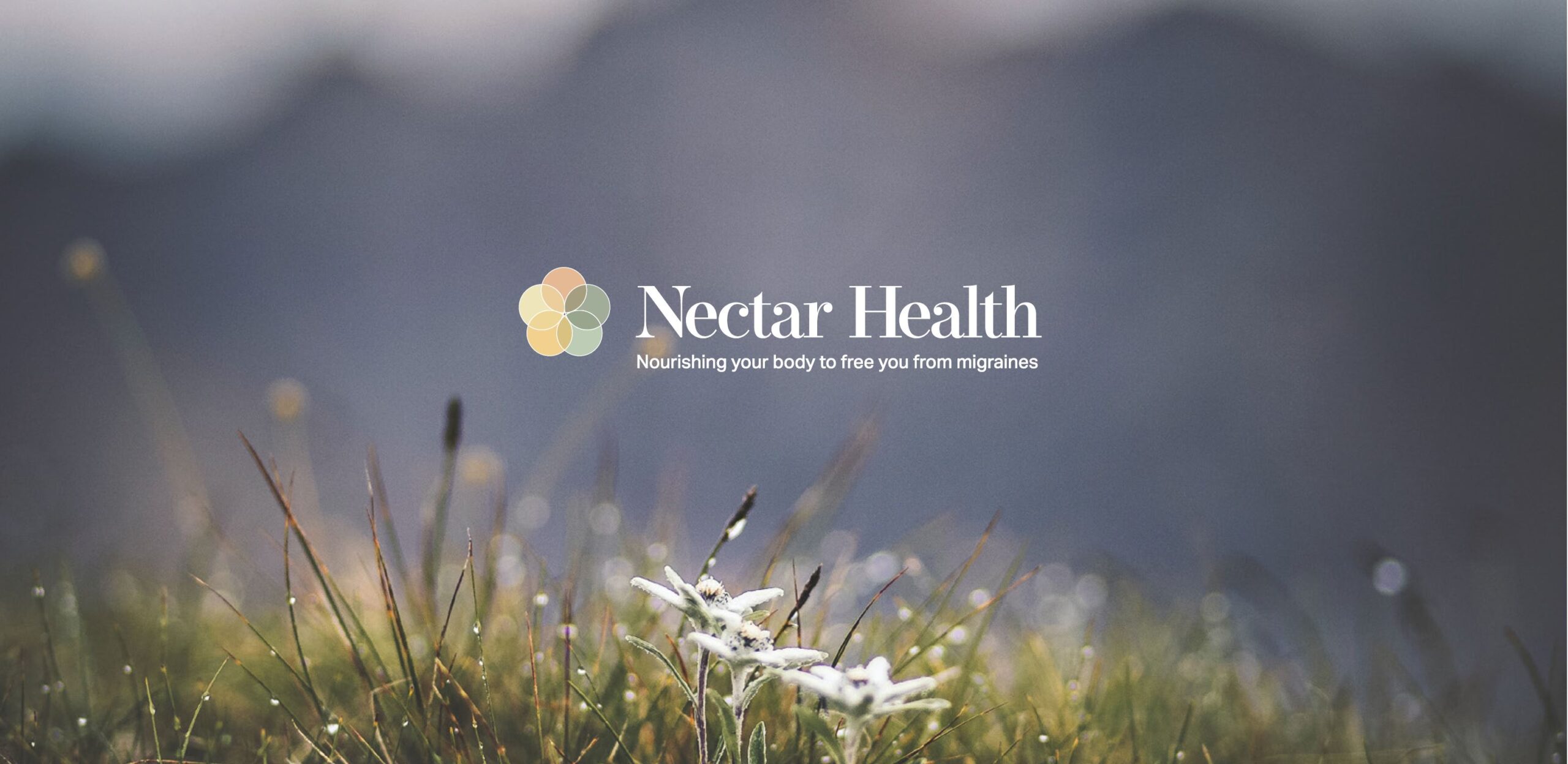
Nectar Health
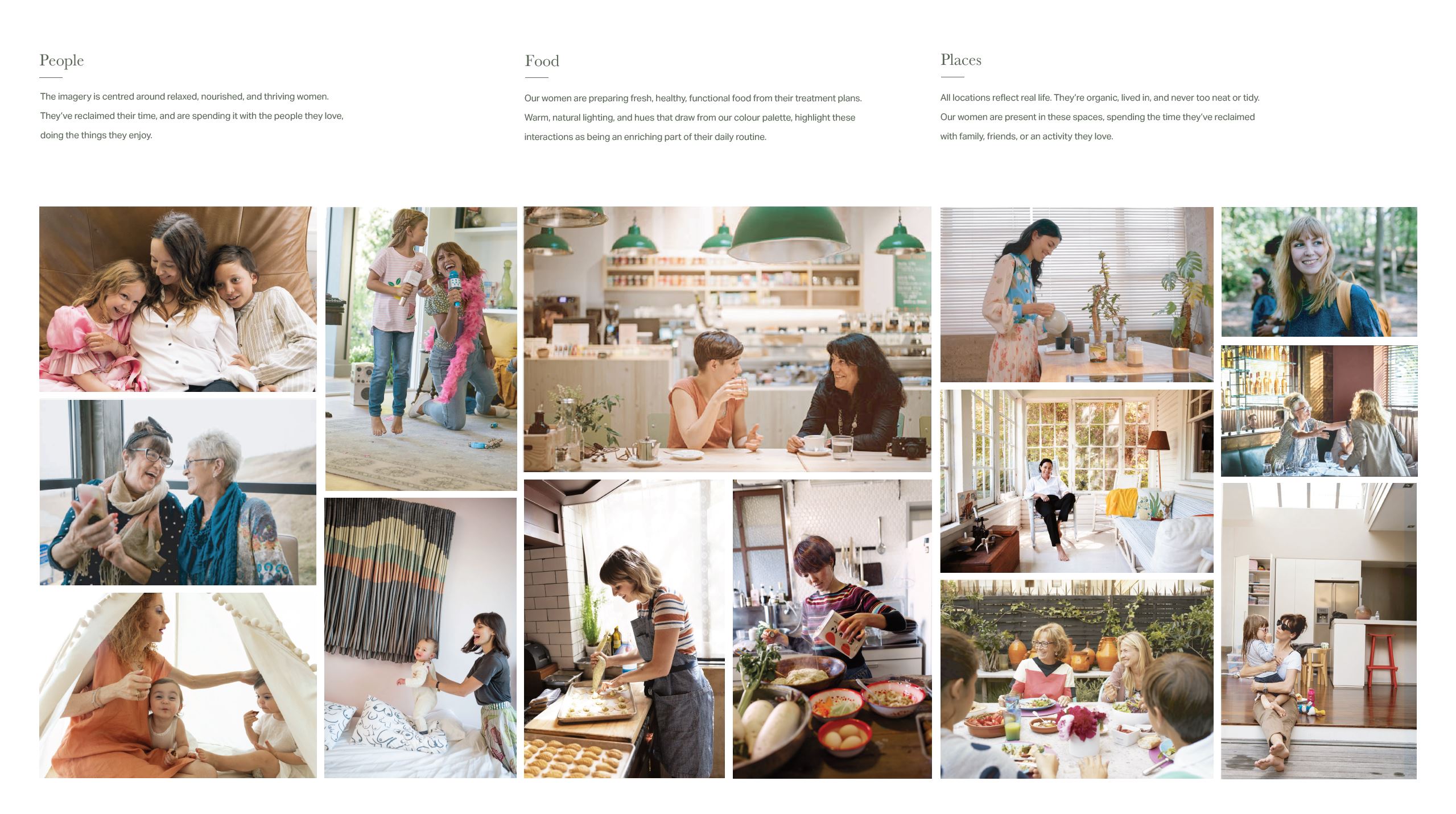
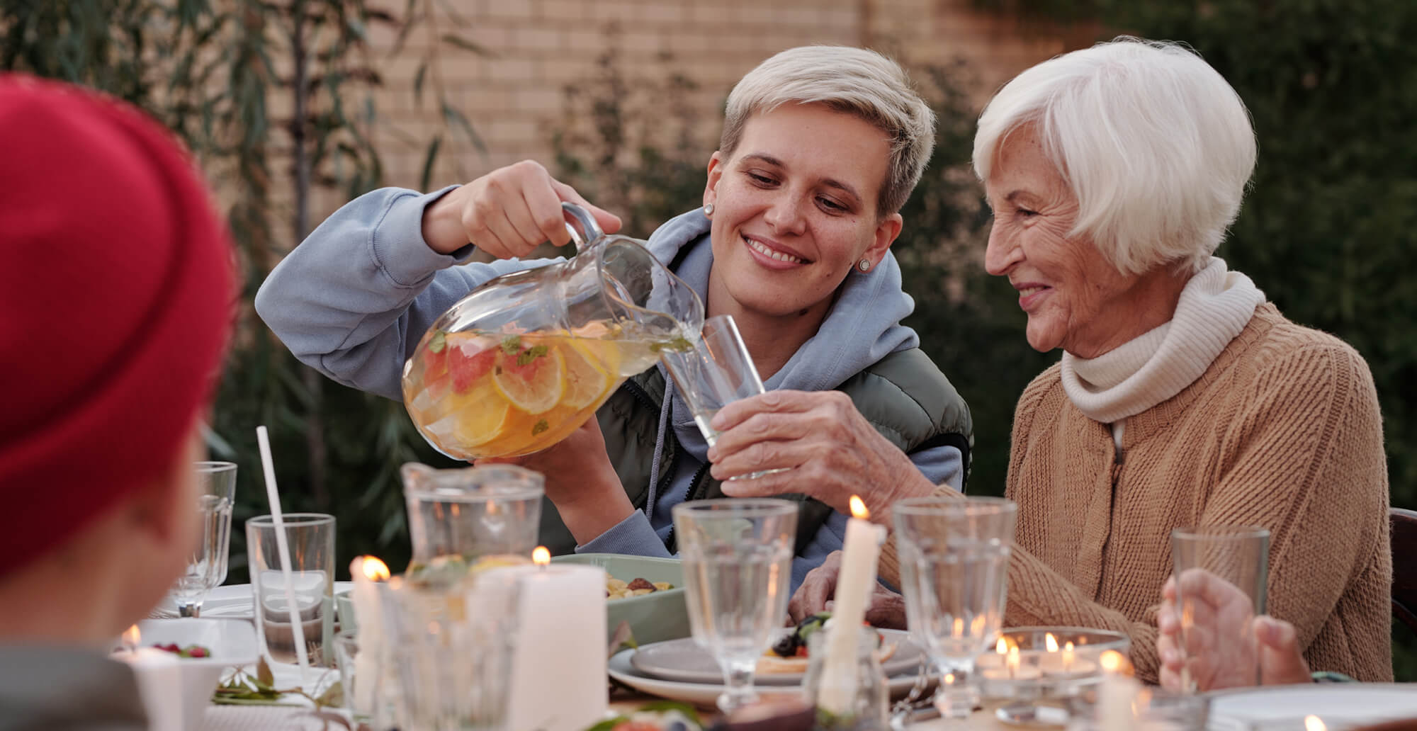
Migraine disease affects over 1 billion people worldwide, with women affected 3-4 times more than men. Nectar health seeks to help women affected by migraine disease to live life to their greatest potential.
Project type
Graphic Design
My role
Branding & Assets designer
Collaborators
Jah Marsh
Kimberly Gajadhar
Te Auta Mc Phee
Christina Jiang
Design tools
Illustrator
Photoshop
InDesign
XD

The
Challenge
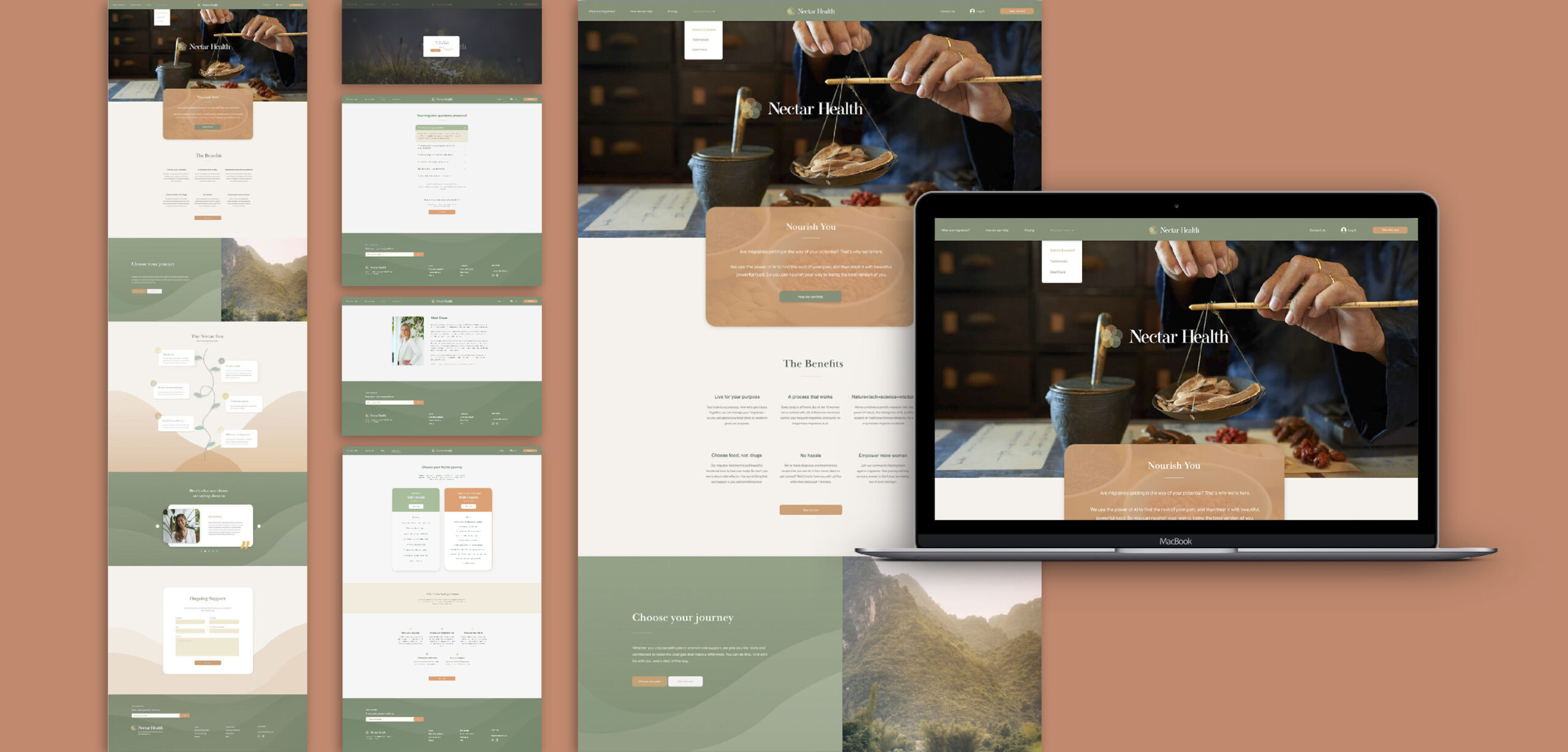
How do we nurture Nectar’s identity to make it suitable and user friendly for women with migraines?
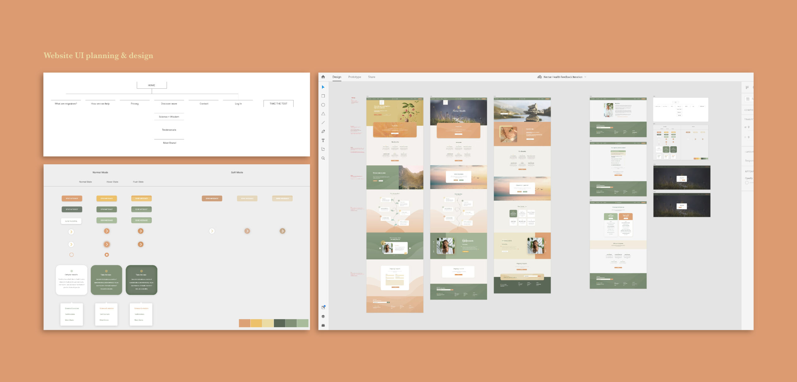
The Problem
Understanding the deliverables
Visual difficulties
Nothing is as annoying as staring at a bright vibrant screen with a raging headache, so with the target audience being women with migraines, we had to be mindful about the colours we use.
Accessibility
These ladies have got enough to deal with. So we need to make a diagnosis and treatment so straight-forward so they can do it from home.
The blend between science and food
To find the right balance of conveying nature and data in harmony. That the treatment process is natural and just beautiful food. The science should be a subtle component but not pushed.
The Solution
DELIVERING THE PRODUCTS
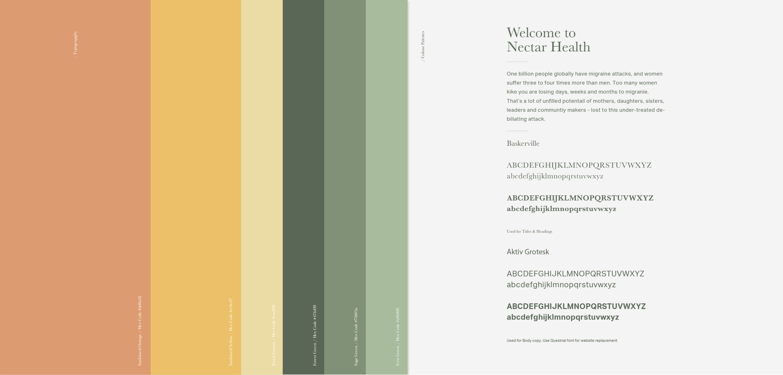
Collecting colours that are light but more dulled down
Our colour palette helps ensure harmony across our product brands. We use flat colour to create lively and energetic communications without being heavy on the eyes.
Seeking the roots of the science and medicine
To create trust with the clients and the treatment, we wanted to seek design and meaning through the foods and how science with the wisdom of traditional Chinese medicine, for a holistic, natural, migraine disease treatment. We researched the fundamental structures of foods, element theory in Chinese medicine to influence our imagery, asset and logo design.
Ease
As part of their design philosophy, we strived to make every element simple and intuitive, to optimize user experience. Adaptive and adaptable. Our goal is to make life easy, comfortable, and navigable.