Trade Me Property
The people's choicest awards
Origins
In November 2024, we launch the ‘Trade Me Property People’s Choice Awards’, inviting Kiwi to get involved and celebrate how they live and could live.
By encouraging nominations and voting in key categories, we build community engagement and trust. This initiative inspires participation, boosts social interaction, and drives increased traffic to the platform.
Opportunity
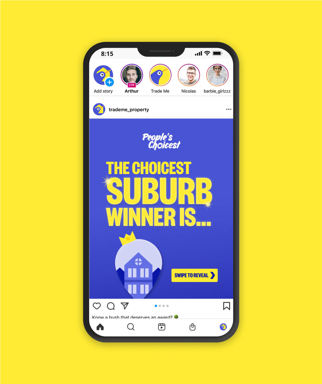
Over four months, I led the visual identity that needed to be bold, memorable, and unmistakably Trade Me. More than looks, it was about connecting with Kiwis aged 25–60 — especially younger property seekers — by showing we understood their lives and aspirations. The aim was to create an immersive experience that cut through the noise, sparked nationwide chatter, and built lasting brand preference.
Project Type
Brand campaign
Visual Identity
Motion Graphics
Digital Marketing
Tools
Figma
Illustrator
After Effects
Photoshop
Midjourney AI
My Role
Lead Brand Designer
Collaborators
Cristina Jiang
Caleb Carnie
Grace Tressider

The
Opportunity
A distinct visual identity
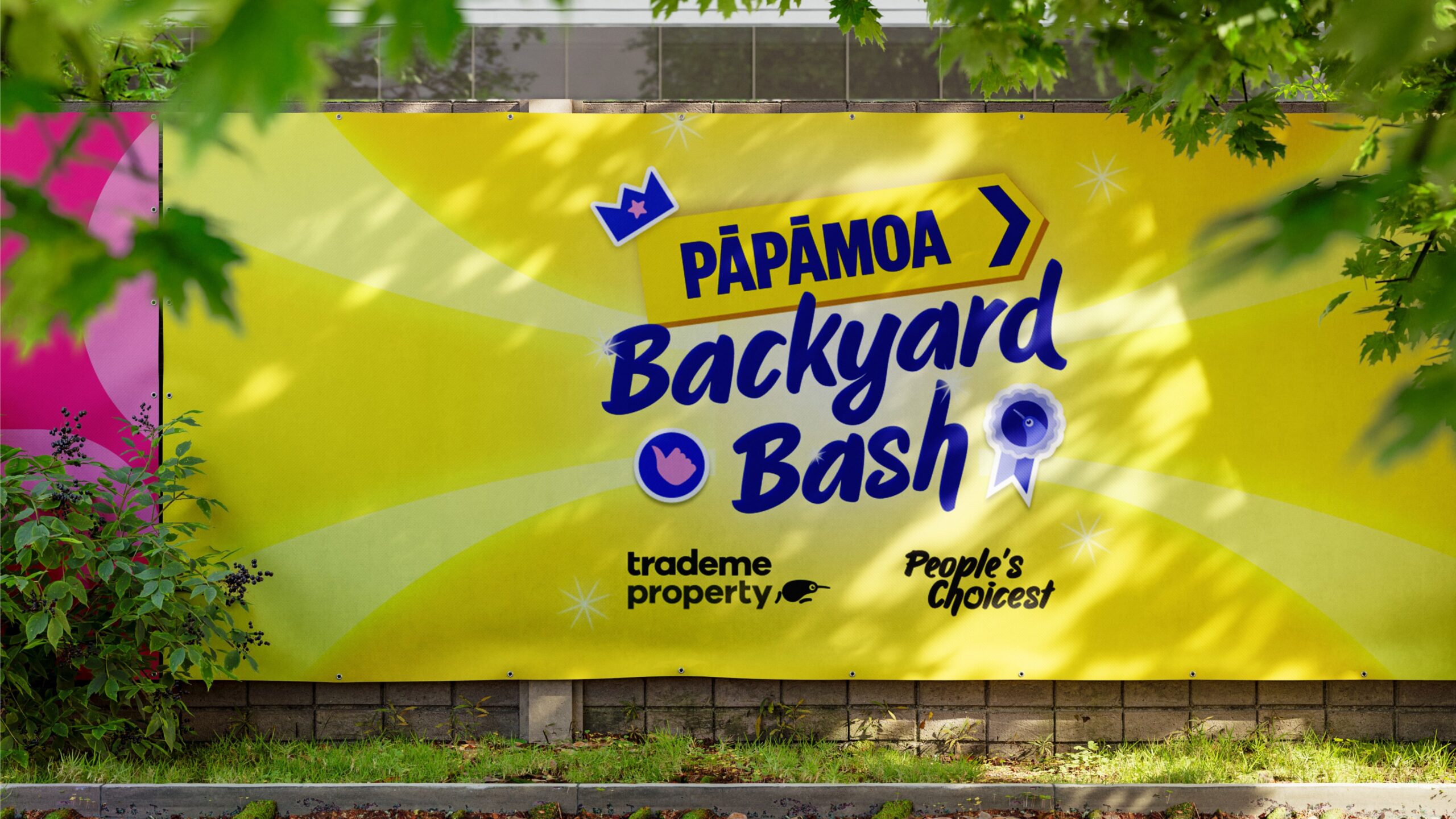
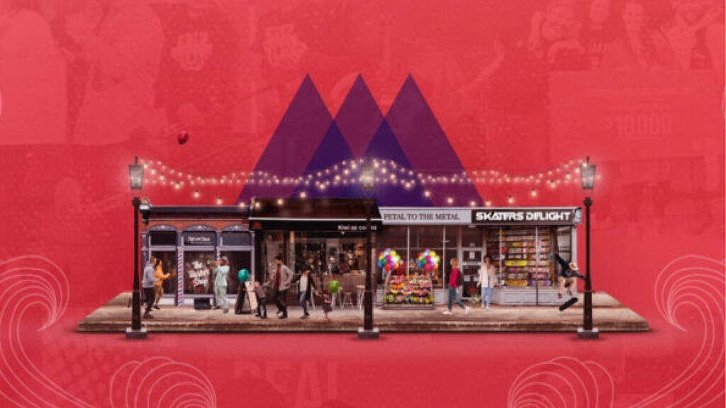
The campaign needed its own look and feel that felt fresh and exciting, but still unmistakably Trade Me. Without this balance, the awards risked blending into the brand’s usual content — and missing the chance to feel like a special, one-off moment.
A multi-stage journey
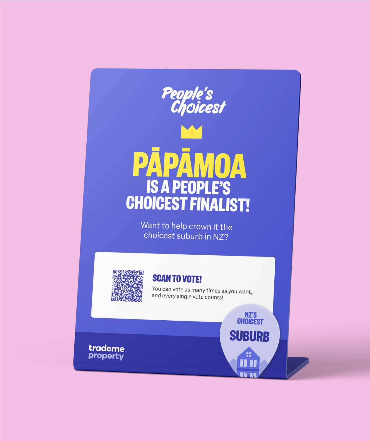
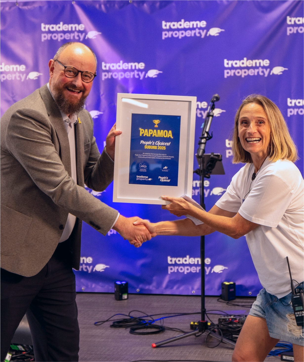
With four phases — nominations, voting, announcements, and a live celebration — the visuals had to evolve as the story unfolded. This progression was important because it helped audiences track where they were in the journey, building anticipation and keeping them engaged through to the finale.
Real-time responsiveness
Public interaction drove the campaign, which meant the design couldn’t be rigidly pre-planned. But reacting too loosely risked things looking messy and inconsistent. The opportunity was to build in a system that gave us room to pivot quickly while still protecting the brand’s integrity.
The
Solution
Playful, celebratory design
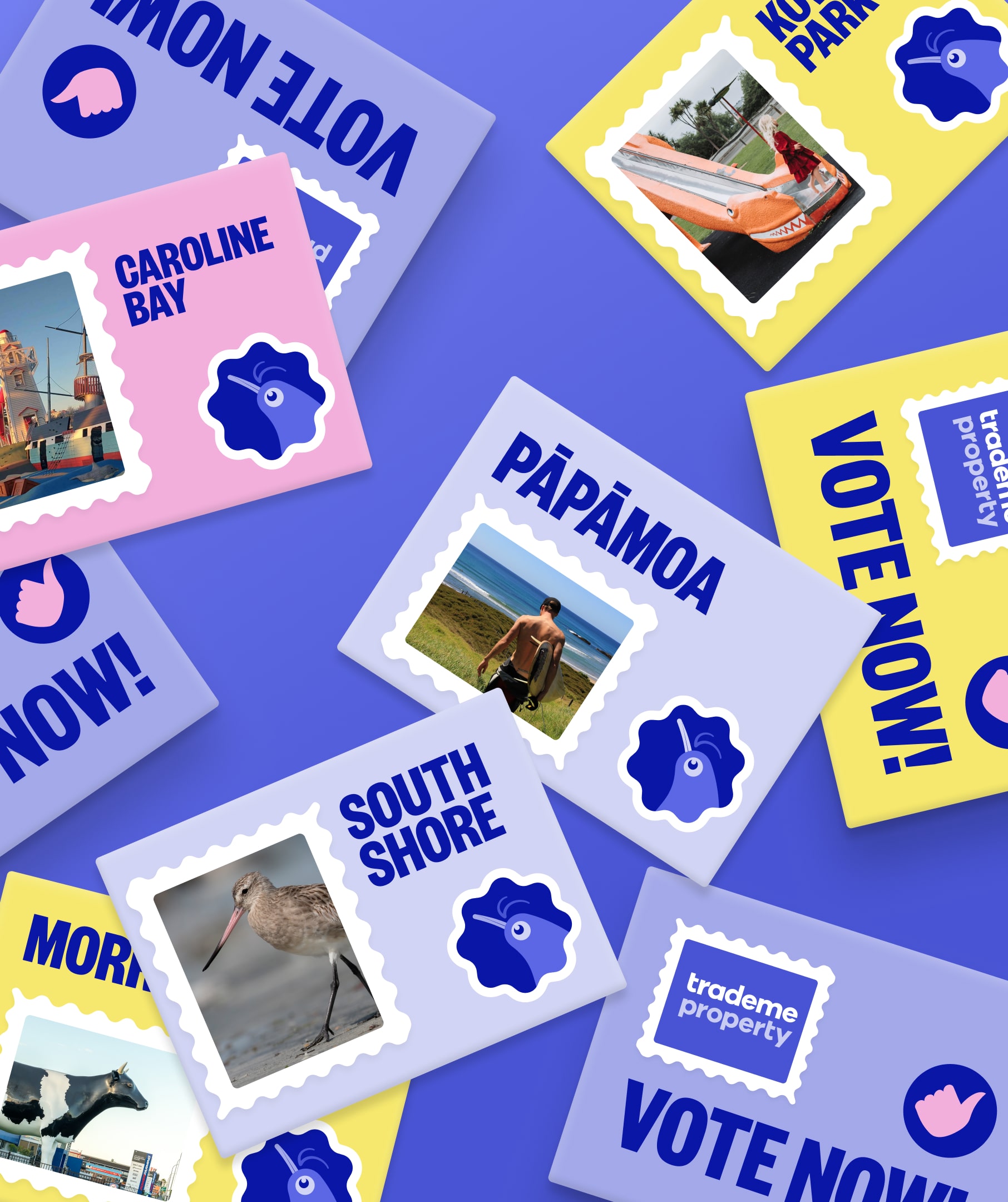
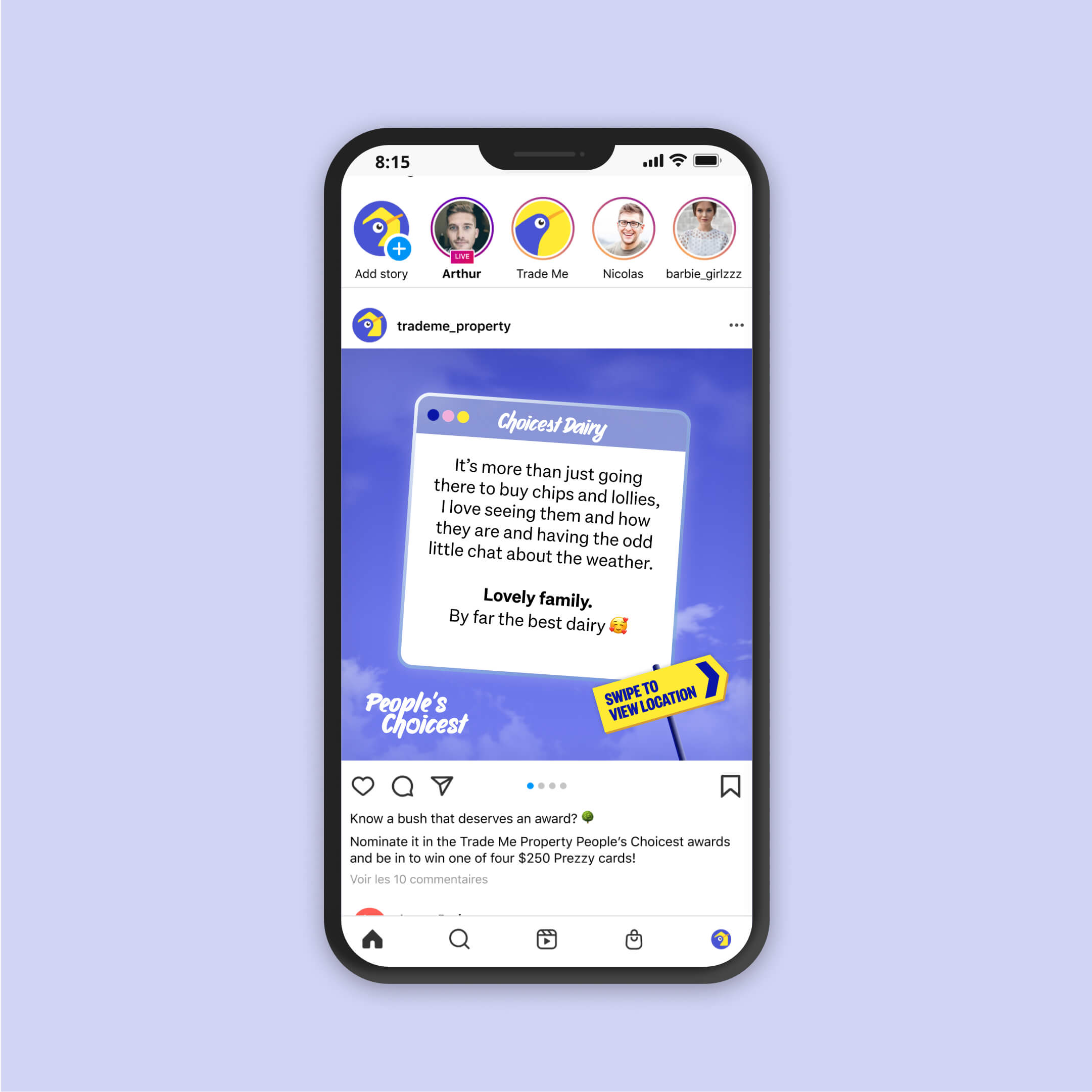
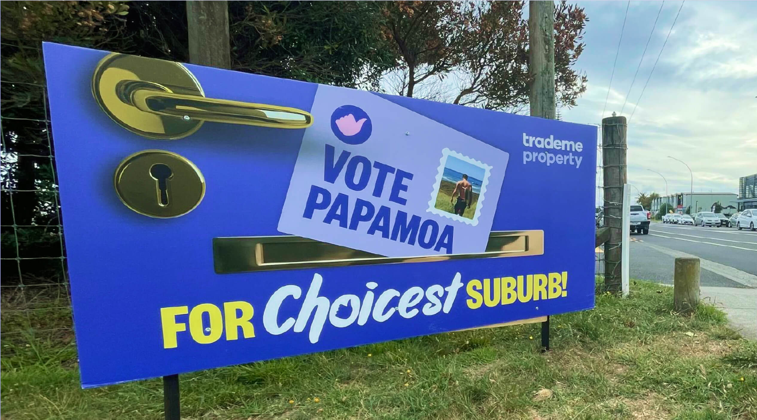
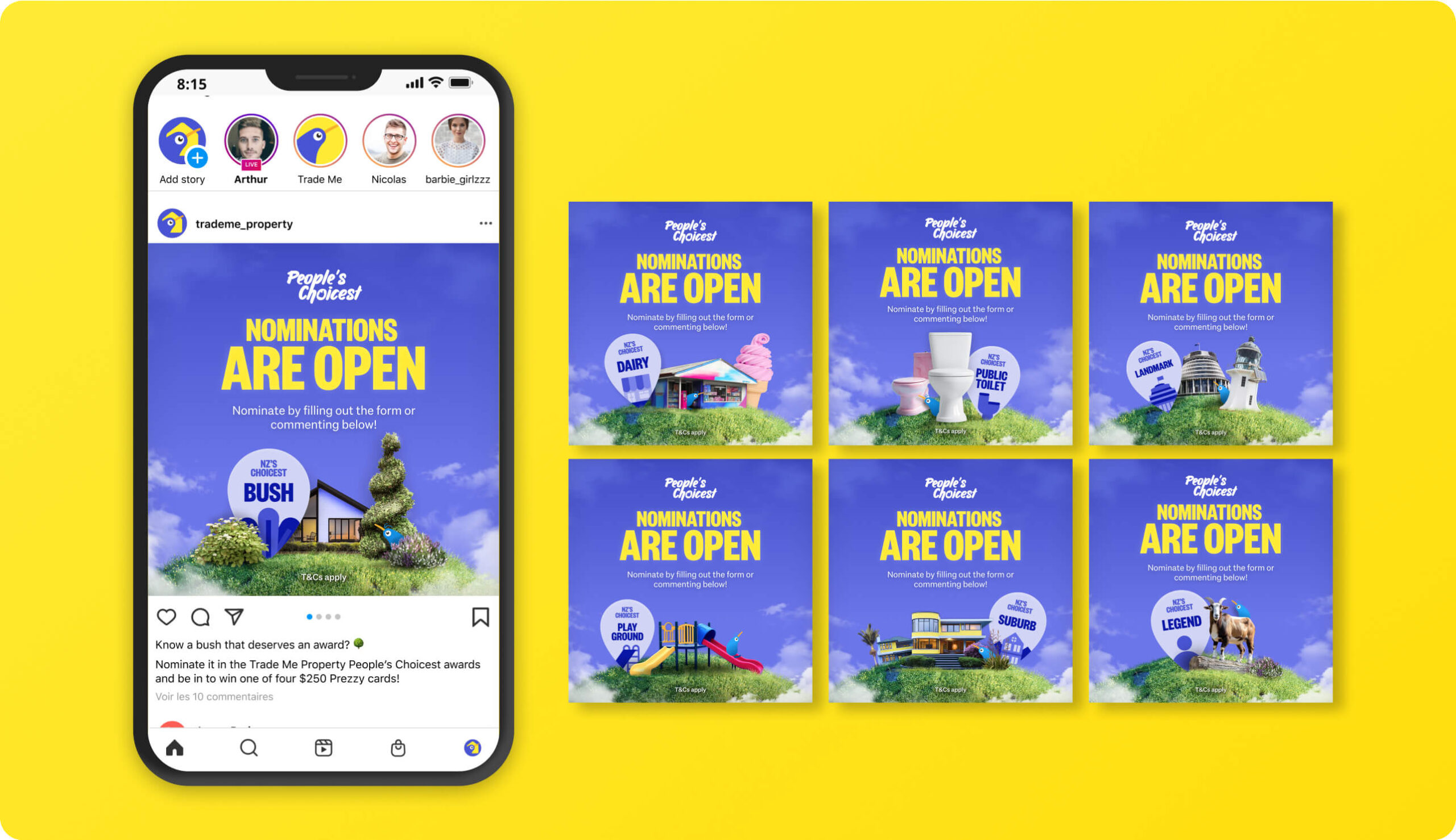
I created a cheeky awards style that spotlighted Kiwi favourites and captured the “people’s choice” spirit. This approach mattered because it gave the campaign personality — making it feel less like corporate branding and more like a community celebration people wanted to join.
A flexible design system
To avoid chaos, I built a library of templates and scalable assets that could be adapted on the fly by both designers and media partners. The system meant we could move quickly without the brand looking scattered — giving speed and consistency equal weight.
Tight collaboration
I stayed in constant contact with stakeholders and media teams, sharing updates and aligning at every stage. This was critical because the campaign shifted daily based on public engagement; close communication kept everyone on the same page and ensured design could keep up with momentum.
The
Outcomes
Kiwi showed up in force!
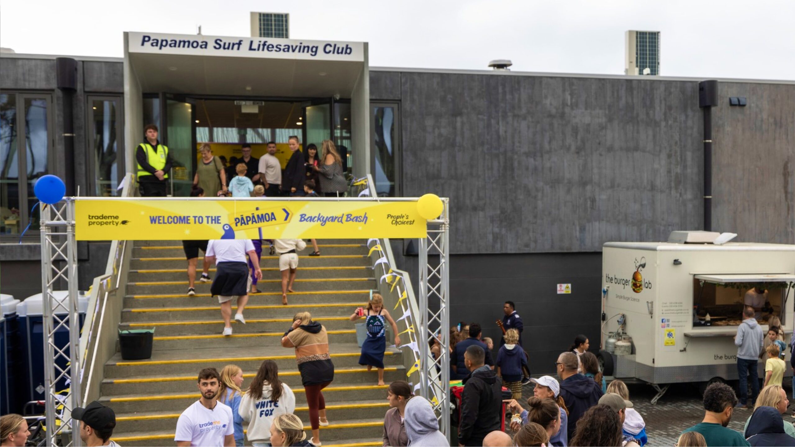
Over 5,000 nominations, 135,000+ votes, and a 25% lift in property platform sessions — plus national media coverage on outlets like Seven Sharp, TVNZ Breakfast, and The Edge. A five-day influencer road trip kept the conversation alive on social and turned the awards into a nationwide moment. The success secured a return for next year, even bigger and choosier, proving that when you put communities at the heart of the story, real connections follow.
